こんにちは、SHUMiSTです。
Simplicity(シンプリシティー)テーマを使用して、STORK(ストーク)テーマを再現というかデザインを近づけるカスタマイズ第9回目です。
前回は、ページトップやカテゴリーページの記事一覧をSTORK(ストーク)テーマのカードタイプ風にするカスタマイズを行いました。
これまで第7回でシンプルタイプ、前回でカードタイプの記事一覧のカスタマイズ行ったので、今回は最後の3種類目の記事一覧「マガジンタイプ」レイアウトにするカスタマイズを行います。
各タイプのデザインは、下記のページを参照してください。


また、テンプレートファイルに変更を加える場合は親テーマの該当ファイルを子テーマのディレクトリにコピーし、子テーマで変更を加えましょう。
記事一覧をSTORK(ストーク)テーマのマガジンタイプ風にしよう!
STORK(ストーク)テーマで選択できる記事一覧レイアウトのうち、マガジンタイプ風のデザインに整えていきます。
Simplicity(シンプリシティー)テーマでは、外観->カスタマイズ->レイアウト(全体・リスト)->一覧リストのスタイルから10種類の記事一覧タイプを選択することができます。
第7回、前回と書きましたが、この10種類の中から上記3種類のタイプを切り替えられるように、各タイプに近いデザインタイプを選んでからカスタマイズを行います。
header.phpのメインカラムボックスにマガジンタイプ用のクラスを追加
前回同様、header.phpのメインカラムボックス(#main)にマガジンタイプ用のクラス(.s-tile_thumb_style)を追加します。
追加前のソース
          <!-- main -->
          <main itemscope itemprop="mainContentOfPage">
            <?php if ( is_list_style_large_thumb_cards() ): //サムネイル大の場合?>
            <div id="main" class="s-large_thumb_style" itemscope itemtype="http://schema.org/Blog">
            <?php else: //それ以外の場合?>
            <div id="main" itemscope itemtype="http://schema.org/Blog">
            <?php endif ?>
追加後のソース
          <!-- main -->
          <main itemscope itemprop="mainContentOfPage">
            <?php if ( is_list_style_large_thumb_cards() ): //サムネイル大の場合?>
            <div id="main" class="s-large_thumb_style" itemscope itemtype="http://schema.org/Blog">
            <?php elseif ( is_list_style_tile_thumb_2columns_raw() ): //タイル2列 画像縦横比保存(要再生成)の場合?>
            <div id="main" class="s-tile_thumb_style" itemscope itemtype="http://schema.org/Blog">
            <?php else: //それ以外の場合?>
            <div id="main" itemscope itemtype="http://schema.org/Blog">
            <?php endif ?>
メインカラム左(記事一覧)にスタイルを設定
今回のカスタマイズのメインであるメインカラム左(記事一覧)にスタイルを設定します。
第7回でメインカラムボックスやサイドバーのレイアウト設定などは完了しているため、今回も比較的簡単にカスタマイズを行えます。
追加ソース
以下の追加ソースを子テーマのスタイルシート(style.css)にコピペ(コピー&ペースト)します。
.s-tile_thumb_style #list a.hover-card {
    font-size: inherit;
}
.s-tile_thumb_style #list a.hover-card:before {
    display: none;
}
.s-tile_thumb_style #list a .entry {
    padding: 1.5% 1.5% 0.5%;
    color: #333;
    border: 0;
    margin: 0;
    width: 50%;
    float: none;
    margin-bottom: .3em;
    border-radius: 0;
}
.s-tile_thumb_style #list a .entry:hover {
    background: rgba(0, 0, 0, 0.05);
}
#main.s-tile_thumb_style .hover-card .entry-thumb {
    width: 100%;
    max-height: initial;
    margin: 0;
    float: none;
}
.s-tile_thumb_style #list .hover-card .entry-card-content {
    padding: 0 0 1.5em;
    overflow: hidden;
    clear: none;
}
.s-tile_thumb_style #list .hover-card .entry-card-content h2 {
    font-size: 1.15em;
    margin-top: .5em;
    margin-bottom: .5em;
    padding: 0;
}
.s-tile_thumb_style #list .hover-card .entry-card-content p {
    font-size: .9em;
    margin-bottom: .5em;
}
.s-tile_thumb_style .entry .post-meta {
    margin: 0 0 1.6em;
    line-height: 1.75;
}
.s-tile_thumb_style .post-meta .post-date {
    color: #333;
}
.s-tile_thumb_style #list .hover-card .entry-card-content .entry-snippet {
    font-size: .7em;
    opacity: 0.7;
    filter: alpha(opacity=70);
    -ms-filter: "alpha(opacity=70)";
    margin: 0;
    padding: 0;
}
メディアクエリにメインカラムボックスのレイアウトを設定
第3回で追加してあるメディアクエリ(1166px以上)の設定にレイアウトを設定します。
追加先のメディアクエリ
@media only screen and (min-width: 1166px) {
//この括弧内に追加する
}
追加ソース
    .s-tile_thumb_style #list a .entry:before {
        bottom: 0;
        left: 0;
    }
    .s-tile_thumb_style #list a .entry:after {
        bottom: 2px;
        right: 0;
    }
    .s-tile_thumb_style #list a .entry:before,
    .s-tile_thumb_style #list a .entry:after {
        position: absolute;
        content: '';
        width: 0;
        height: 1px;
        background-color: #111;
        transition: .3s;
        display: block;
        clear: none;
    }
    .s-tile_thumb_style #list a .entry:hover:before, .s-tile_thumb_style #list a .entry:hover:after {
        width: 100%;
    }
既存のスタイルに要素を追加
第3回、第4回、第7回、第8回で追加した既存のスタイルに今回、同様のスタイルを適用するため要素を追加します。
追加前のソース
#header-in:before, #header-in:after,
.menu:before, .menu:after,
#h-top:before, #h-top:after,
#body-in:before, #body-in:after,
#main:before, #main:after,
#list .entry:before, #list .entry:after,
#list a.hover-card:before, #list a.hover-card:after,
.s-large_thumb_style #list:before, .s-large_thumb_style #list:after,
.s-large_thumb_style #list .hover-card .entry-card-content:before,
.s-large_thumb_style #list .hover-card .entry-card-content:after {
    content: "";
    display: table;
}
#header-in:after, .menu:after, #h-top:after,
#body-in:after, #main:after, #list .entry:after,
#list a.hover-card:after,
.s-large_thumb_style #list:after,
.s-large_thumb_style #list .hover-card .entry-card-content:after {
    clear: both;
}
追加後のソース
.s-tile_thumb_style #list関係のbefore、after要素を追加します。
#header-in:before, #header-in:after,
.menu:before, .menu:after,
#h-top:before, #h-top:after,
#body-in:before, #body-in:after,
#main:before, #main:after,
#list .entry:before, #list .entry:after,
#list a.hover-card:before, #list a.hover-card:after,
.s-large_thumb_style #list:before, .s-large_thumb_style #list:after,
.s-large_thumb_style #list .hover-card .entry-card-content:before,
.s-large_thumb_style #list .hover-card .entry-card-content:after,
.s-tile_thumb_style #list:before, .s-tile_thumb_style #list:after,
.s-tile_thumb_style #list .hover-card .entry-card-content:before,
.s-tile_thumb_style #list .hover-card .entry-card-content:after {
    content: "";
    display: table;
}
#header-in:after, .menu:after, #h-top:after,
#body-in:after, #main:after, #list .entry:after,
#list a.hover-card:after,
.s-large_thumb_style #list:after,
.s-large_thumb_style #list .hover-card .entry-card-content:after,
.s-tile_thumb_style #list:after,
.s-tile_thumb_style #list .hover-card .entry-card-content:after {
    clear: both;
}
function.phpにマガジンタイプの記事一覧用のサムネイル画像サイズを設定
STORK(ストーク)テーマでは、各タイプ毎にサムネイル画像サイズが違うため、第6回で書いた理由によりマガジンタイプ用のサムネイル画像サイズを設定します。
追加ソース
//記事一覧タイル2カラム(縦横比保存)のサムネイル画像を設定
add_image_size('thumb349_raw', 349, 0, false);
entry-card.phpのタイル2カラム(縦横比保存)のサムネイルサイズ設定を変更
entry-card.phpのタイル2カラム(縦横比保存)のサムネイルサイズ設定を”thumb320_raw”から先ほど設定した”thumb349_raw”に変更します。
変更前のソース
    <?php else: //大きなサムネイルカードの場合?>
      <?php if ( has_post_thumbnail() ): // サムネイルを持っているとき
        //サムネイル画像の縦横比を保存するかどうかで取得するサムネイルを変化
        $thumb = ( is_list_style_tile_thumb_cards_raw() ? 'thumb320_raw' : 'thumb356') ?>
変更後のソース
    <?php else: //大きなサムネイルカードの場合?>
      <?php if ( has_post_thumbnail() ): // サムネイルを持っているとき
        //サムネイル画像の縦横比を保存するかどうかで取得するサムネイルを変化
        $thumb = ( is_list_style_tile_thumb_cards_raw() ? 'thumb349_raw' : 'thumb356') ?>
カスタマイズまとめ
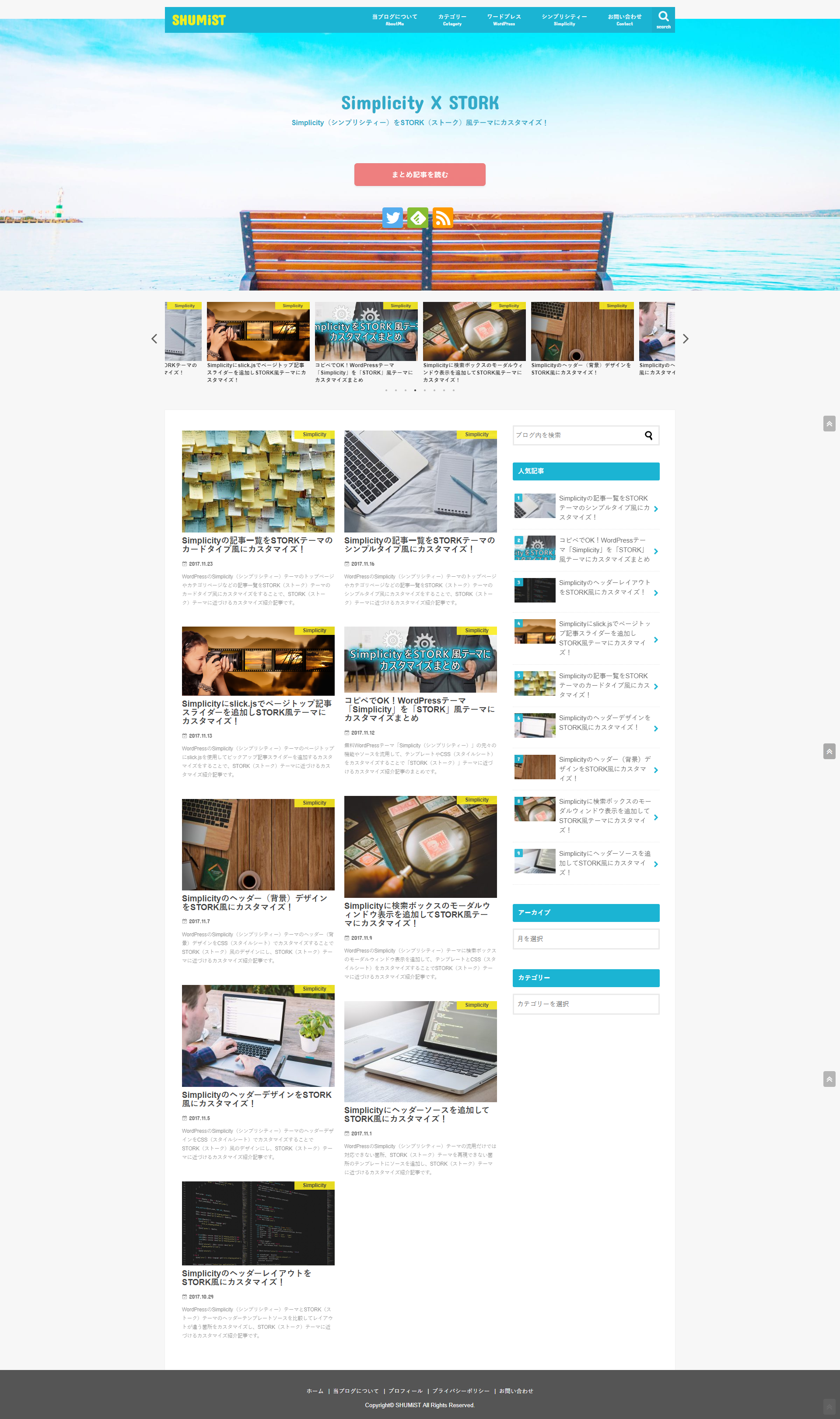
今回のカスタマイズにより、メインカラム左(記事一覧)がSTORK(ストーク)テーマのマガジンタイプ風に変わりました。
また、第7回、前回と同じくSimplicity(シンプリシティー)テーマの記事一覧リストのスタイルからタイル2カラム(縦横比保存)に上記のマガジンタイプを割り当てたので今後は外観->カスタマイズ->レイアウト(全体・リスト)->一覧リストのスタイルからタイル2カラム(縦横比保存)を選択することで切り替えができるようになってます。
今回で予定していたメインカラム左(記事一覧)のスタイルをSTORK(ストーク)テーマのシンプルタイプ、カードタイプ、マガジンタイプ風にし、各レイアウトタイプをSimplicity(シンプリシティー)テーマのカスタマイズから自由に変更できるカスタマイズが完了しました。
次回は、サイドバーのスタイルのうち基本とinputを使用する検索ボックスやカテゴリー・アーカイブのドロップダウンセレクトボックスなどのフォーム関係のスタイルをSTORK(ストーク)テーマ風に変更するカスタマイズを行います。
Simplicity(シンプリシティー)テーマの元々の機能やソースを流用して、STORK(ストーク)テーマに近づけているため、STORK(ストーク)テーマのソースをそのまま丸ごと利用したりはしておりませんので中身はまったく別物です。
STORK(ストーク)テーマの機能面などを利用したい方はSTORK(ストーク)テーマを購入してご利用ください。
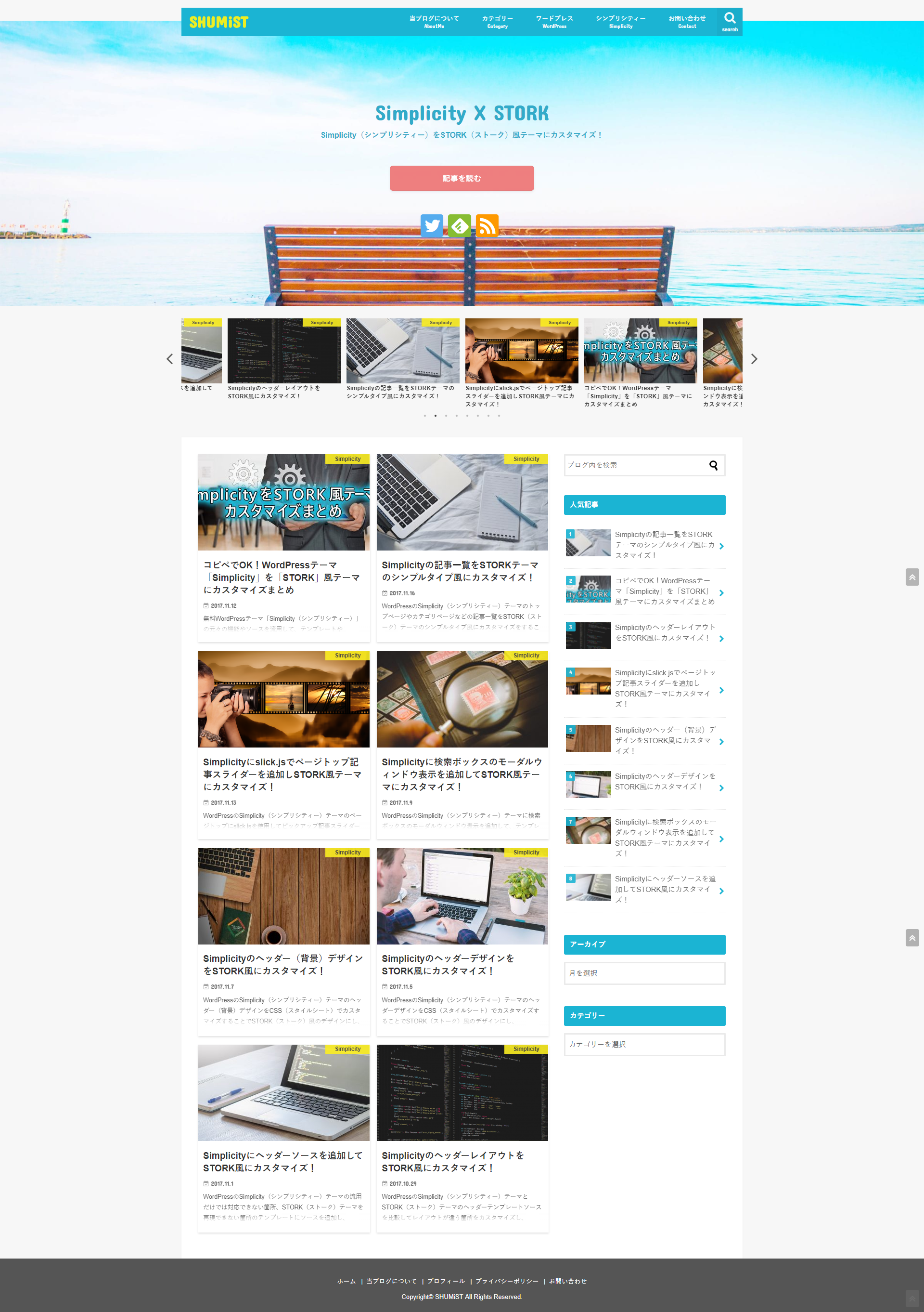
今回のカスタマイズ前後のスクリーンショット
カスタマイズ前
カスタマイズ後
